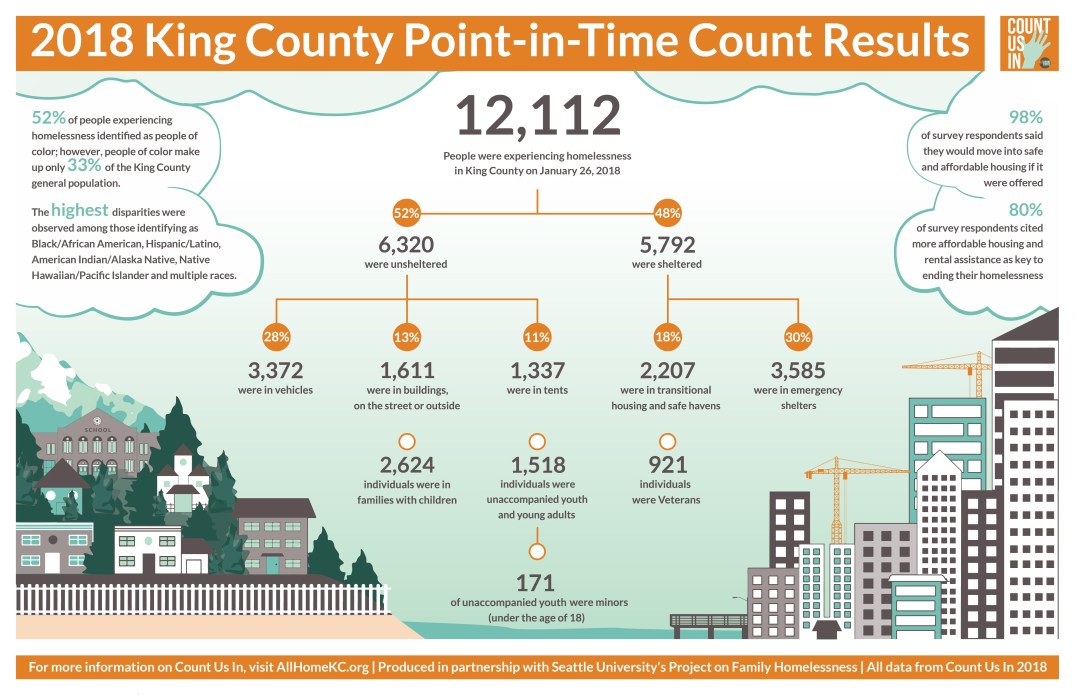
When All Home in late May announced the results of this year’s point-in-time count, they used an infographic created by our Digital Design project, Madison Vucci. Madison worked for months — without data, a huge challenge in itself — to create a design that calls out the data quickly and cleanly while portraying the geographic landscape of our region.
This is the third year in a row that Seattle University students have designed the infographic. Amy Phung (SU ’16) created the very first, while Mandy Rusch Arroyo (SU ’17) designed the 2017 version.
WORK TYPE: Infographic and Logo Design
CLIENT: All Home King County
DESIGNER: Madison Vucci
YEAR: 2018
