By Mandy Rusch, Digital Design Project Assistant, Project on Family Homelessness
This past winter, Schoolhouse Washington approached us with an exciting new project: to create visualized data graphics for use in their communication materials. In this post, I will describe my approach and learning process over the course of the project, which taught me a lot about what it takes to develop advocacy tools.
Schoolhouse Washington is a partnership between Building Changes and Columbia Legal Services. The organization was formed because these two partners wanted to get more directly involved in advocacy to improve housing stability and advance educational success for the nearly 40,000 students in our state who experience homelessness.
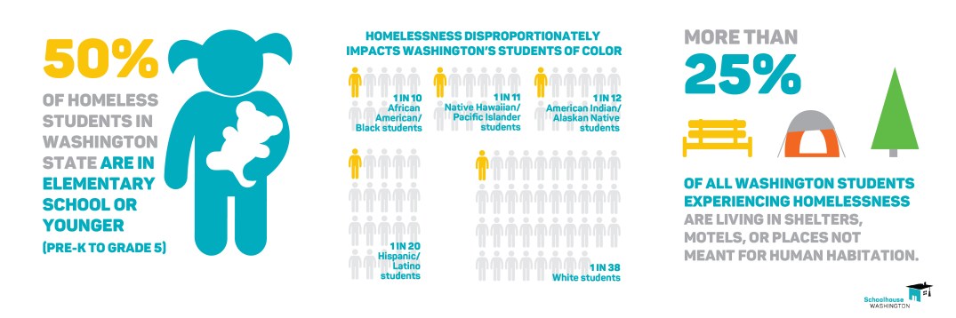
One important way that Schoolhouse Washington advocates is through the use of data. They analyze the student homelessness data provided by the Office of the Superintendent of Public Instruction, which is important to share because it helps describe needs to lawmakers and policymakers.
Graphic data visualizations, or “infographics,” are an incredibly powerful way to share data like this. The use of images and charts to show data visually helps to tell a clear message that is easier for viewers to digest than a written document alone. Continue reading →